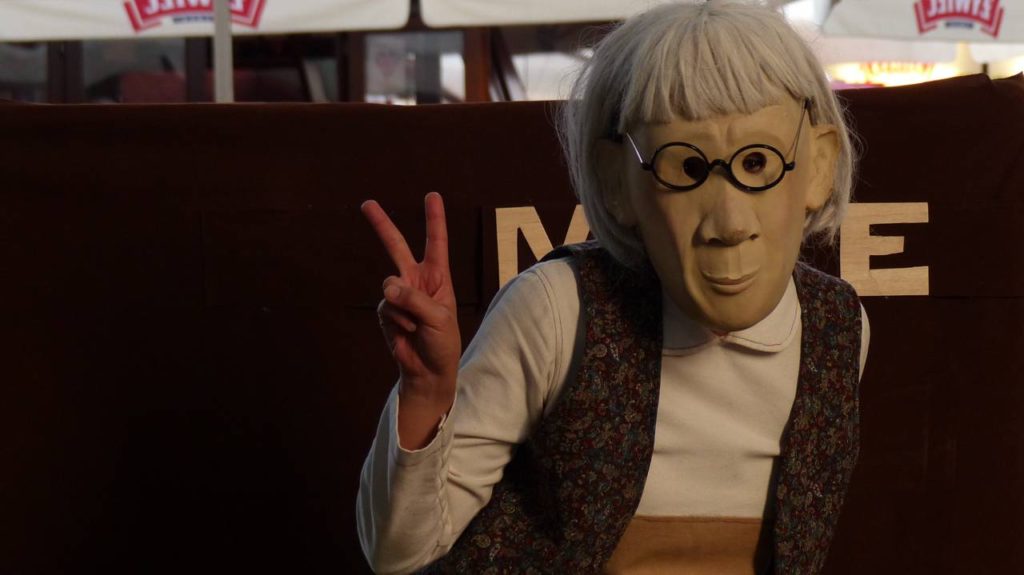
A promo photo is an essential content asset of a performing artist’s marketing pack. You only have one chance to make a first impression, so make sure your picture tells the right story.
This text is part of my series on marketing for performing artists. Don’t forget to check my other articles:
- How to write a street show promo text and artist bio
- How to make a promo video that will get you more festival bookings
- Why do you need a website if you are a performer?
- Content strategy for a performing artist’s website
In this article, I focus on conveying the right message through promo photos, not the technical aspects of photography. I also include tips on sharing pictures legally and what you need to remember when uploading them on your website.
Note: All photos that I use in this post are not promo assets of the artists in the images. Although photos taken during live performances are different from staged shots, I’ve decided to use them to explain various aspects you should have in mind when getting ready for your photo shoot.
The importance of promotional pictures
You need promo photos to attract bookers and new followers, encourage people to come to your show and generate buzz around your new projects. Event organisers require content to be shared online, sent to the press or included on flyers and posters.
People like to know who they are going to see. It’s easier to attract a potential audience if there is visual content, not only text. It also helps to memorise an artist.
Promo photos help to build your image as an artist and a connection with your audience. They must be of high quality if you want people to think of you as a professional performer.
Key elements of a successful artist promo photo
Your promo photo should be visually compelling, tell a story, and reflect your personality, stage persona, skills, and show. It’s part of your branding as an artist.
Be true to yourself and your art
A photographer should have a clear vision of your artistic style and vibe that you want to convey. Brainstorm your ideas, but make sure your photos are true to your art to build a connection with the audience that is your target group.
Don’t pose looking like a rockstar or dressed like a Disney princess if that’s not how you feel, look on stage or want people to perceive you.
Give a taste of your performance
Street festivals feature performers representing various artistic disciplines, from musicians, dancers to circus acts. With just one glance at your promo photo, your audience should be able to imagine what your performance is about. It should focus on you and your circus props or musical instruments.

Make a statement with costumes
Clothes and makeup matter. Choose the ones that make you feel comfortable and that you’d wear to a gig. If you don’t know how to pose in front of the camera, they will help you get into your character and look natural. Your stage costumes will also allow you to introduce your artistic brand (but avoid wearing a t-shirt with your logo).
Show passion and energy
Tobiasz Papuczys, a theatre photographer, advises you to capture your emotions.
A promo photo should show the energy of a performance – the one of a performer more than the audience.
In a successful photo, we can see the passion of an artist, his commitment and energy.
In my opinion, it is all about capturing emotion and maybe a formal dynamic of photography (a close photo at a wide-angle would be better than a telephoto; you need an attractive, perhaps not the typical composition that draws attention to the picture).
It’s always lovely to see the artists’ sense of humour in the picture, irony, the ability to laugh at themselves, and the feeling that they are enjoying their work.
Tobiasz Papuczys
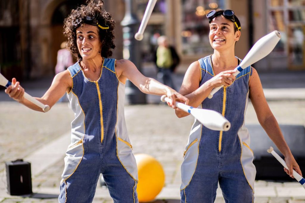
Selecting promo photos for festivals
Include colour photos
Organisers usually print colour promotional materials. Although black and white photography has many advantages, mixing colour photos with black and white ones on posters or photo collages prepared for online advertising purposes is not a good idea.
Colours can stir emotions and attract the human eye. Media often describe busking festivals as “the most colourful events” in their cities, so the organisers want to reflect in their promo materials that it’s time for a celebration, not mourning.
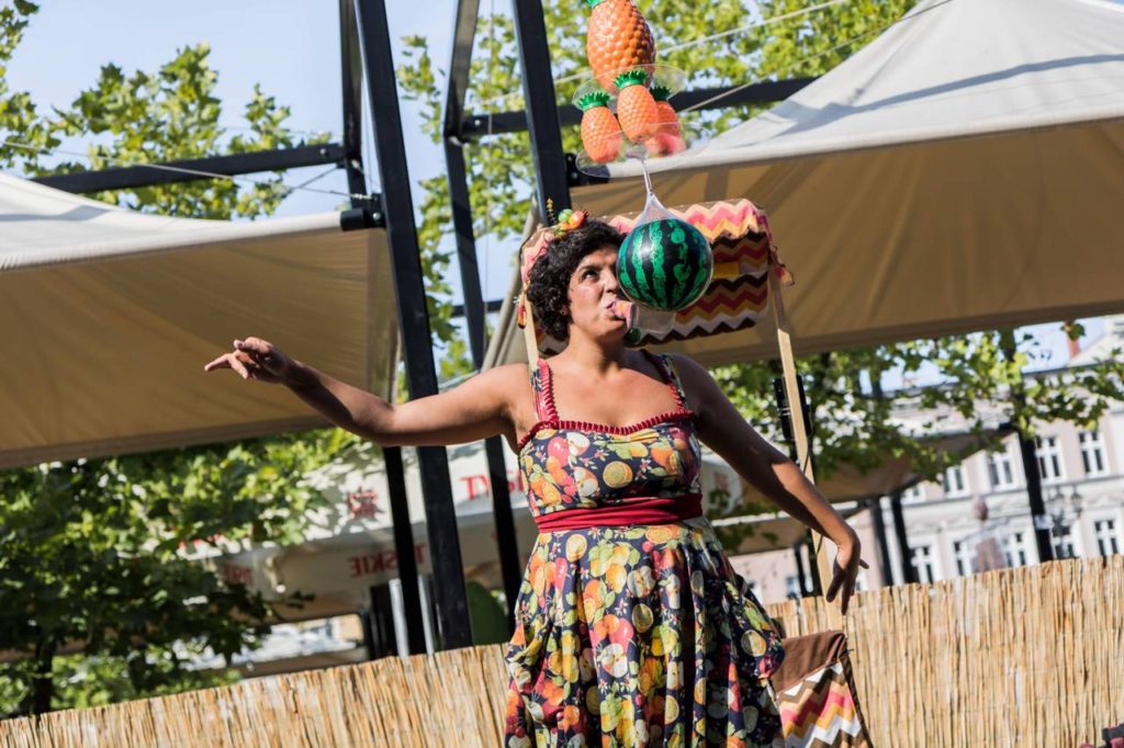
Use staged photos
Sharing photos of you busking in front of a big crowd can be tempting but has some pitfalls.
It’s challenging to take control of what is in the picture taken during street shows. Sometimes someone in an audience grabs too much attention. If you interact with volunteers, they may not be happy to see themselves on the posters one day. There might be brands visible in the background (think of store names, logos on restaurant umbrellas, sponsorship boards, and festival branding).
Organisers don’t want to promote other events while inviting people to theirs. Use photos without any logos unless you are returning to the same theatre or festival.
Share live shots on social media and your website. In your press pack, think of them as an addition, not a replacement of your staged photos.
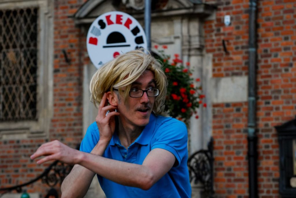
Share photos without a watermark
You should send photos without watermarks, as they can impact the viewing experience and ruin the posters. Removing the watermark violates copyrights, so a graphic designer cannot just crop the picture.
Photographers use watermarks to protect people from stealing their images; however, you should have the right to use images that you include in your promo pack.
If required by the author (and copyright holder) send credits to acknowledge them. The organisers can add their details when it is possible.
Provide vertical and horizontal photos
Ensure you provide vertical and horizontal photos, so if graphic designers need them in a specific format, they will have them handy. Provide a couple of options because media outlets, promoters and publicists like to have a choice, and one image can look better on the flyer and the other one on their website.
Prepare an image for print and web
Journalists and festivals need high-resolution images, especially for printed materials. It is easy to make a large image smaller, but not the other way around. Too small images will look fuzzy and blurry.
Krzysztof Szatkowski, marketing manager, reminds: “A promo photo must be of high quality, so it must be of a high-resolution. It’s challenging to use low-resolution ones for the posters of B1 size, not to mention large format printing. An image for printing should have a resolution of 300 DPI. The other thing I would like to point out is that artists should send the files in photo formats, not pasted in the Word document (which I recommend only to share text).”
Ask a photographer to prepare photos in various file types (for example, TIFF for print and JPG for website).
Make a list of places where you will use the photos
Before you start your photo session, discuss with your photographer the purpose of the photos. Take into consideration multiple options like social media, website or printed materials.
Suppose you need a profile photo for your social media profile. In that case, you need one for a Facebook profile photo that will look good reduced to a thumbnail, for Instagram – one that can crop without killing the overall composition, landscape photo for profile covers, etc.
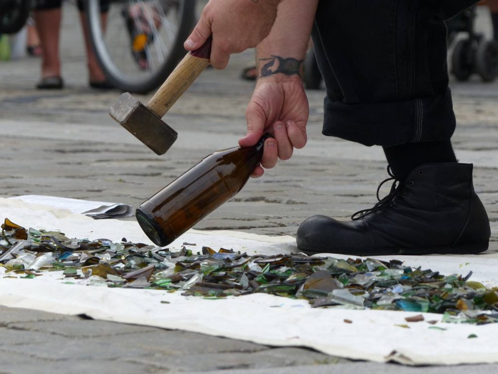
How to legally use photos
Many people think that if they are in a picture, they can use it as they wish. It’s just not how things work. Please have in mind that the law may vary depending on the country, but there is one general rule – you need consent to use the photos that you didn’t take. Don’t violate the copyrights, as you wouldn’t like someone else to take advantage of your work. Use images only with the copyright owner’s permission.
You need to confirm how and where you can use them; for example, even if someone lets you upload their picture on Instagram, it doesn’t mean you can use it as a cover of your music album or advertise products. It works both ways. Allowing festival organisers to use the photos of you to promote their festivals doesn’t mean that they can sell t-shirts with your face without asking you first.
If you make a living out of performing, consider hiring a photographer to take some decent photos and make sure you:
- include various fields of exploitation (the ways the work may be used)
- discuss the attribution.
Check beforehand the copyrights law in your country to sign a contract that would work for you best.
Sharing photos from other profiles on social media
Downloading photos from websites or social media of other people and uploading them on your social media without the copyright owner’s consent is infringing copyrights. Even if you give credit in the caption or tag the owner in the photo, you need their permission. The exception is when an application provides a native feature that allows you to repost (for example, when you click “share” on Facebook).
Do: You don’t need permission if you use the share option. As your followers will see who posted a photo, take an opportunity to build a good relationship. Thank the organisers for inviting you, your audience for a warm welcome, a photographer for capturing a moment or media for press coverage.
Don’t: Don’t save the photos and then upload them without the copyright owner’s permission.
Do: You are allowed to share posts to your stories (if a user enabled this option) and reshare stories.
To share someone’s Instagram story to your story, users need to tag you or mention you. Encourage your audience to do so by having a board with social media logos and your username(s) visible during your performance. It’s also a way to gain new followers.
User-generated content helps build loyalty (think of it as testimonials). It will help you reach a wider audience and promote your performance. Resharing stories from your show is a gesture towards a person who posted it and shows your followers and festival bookers that people enjoyed your show. It’s also proof that you don’t ignore your fans.
Don’t: There is no built-in feature that allows reposting on Instagram. Repost tools do not replace granting of permission.
Optimising photos for your website
Choosing beautiful photos is one thing, but there are a couple of other factors you need to have in mind when it comes to uploading them on your website.
Have a press kit
You need high-resolution photos for journalists and organisers, but don’t upload them on your website for display purposes. Instead, upload them as a bundled pack in a ZIP or use services like Dropbox. This way, people will be able to download your press kit whenever they need it.
Sharing a link to your media package available on your website is better than sharing files directly. Email clients have a limit on the size of attachments. If you send transfers through the free file-sharing services, use the ones where links don’t expire after a couple of days. People may need more time to download them.
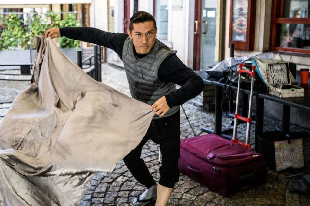
Resize images for web
Reduce your images’ file size to help improve your website’s performance. In other words, so they can:
- load fast – better user experience
- help SEO – your website will rank higher in search engine results, e.g. Google. Big files harm affect speed, bounce rate, etc.
- use less storage and bandwidth.
Don’t upload pictures of 5 MB and 5000px width. A photo doesn’t need to have more pixels than the resolution of the screens that people use to view it. Depending on your theme, you may need different dimensions of images for your website, but it’s usually not more than 1280 pixels wide.
Your goal is to lower a file size without reducing the overall image quality. When you resize, make sure to keep the proportions the same so you don’t distort your image.
If you use a photo tool, look for the option “save a photo for the web”.
Rename the image
Make sure to rename your photos to something proper instead of image1.jpg or IMG_123. If people download the photo, they will be able to see the name. When it comes to promo photos, a good practice is to include your name and credits. This way, if someone doesn’t use your photograph immediately, they won’t have to search who is in the picture and who took it. Use dashes between text in the image name, for example, your-name-photo-by-photographer.
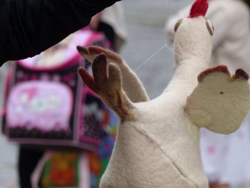
Add ALT Tag
When you upload images, don’t forget to add the ALT tag (alternative text, alt attribute or alt descriptions):
- ALT tag describes images, so it is the first principle of web accessibility. The screen reader will read it aloud for visitors who cannot see them. If you don’t provide the ALT text, they will only learn that you added an image, but not what it contains.
- It is also what search engines use to read images, so it has SEO benefits.
Tip: Filling in name, alt tags, and captions boosts SEO. However, you should avoid keyword stuffing; otherwise, your site can be seen as spam. Keep them short but descriptive.
Summary
Photos are a crucial part of your promo package. You need an asset that will look good online and in printed newspapers or posters. Include a variety of vertical and horizontal hi-resolution images. They should be of high-quality, visually compelling, explain your show and reflect your style. Be authentic and make sure that they present your professionalism and the story that you want to share.
What are you looking for in the photos? How did you come up with the ideas for your promo shots? Do you have any other tips? Share your thoughts in the comments!
—
All photos were taken at the Busker Tour (previously BuskerBus Festival) by me or the photographers credited in the captions.
